Behind the Scenes on the BIBA Conference
- Molly Phillips

- May 27
- 5 min read
This year marked the 48th anniversary of the British Insurance Brokers’ Association (BIBA) Conference: the world’s largest insurance broking event. With over 10,000 attendees, footfall was heavy, and it posed an extraordinary opportunity for insurance brands to have some in-depth conversations, gain the traction they deserved, and promote their valuable work to those all-importance connections.
Long-term blog readers will know that we don’t shy away from a challenge when it comes to designing and building multiple exhibition stands at once.
With that in mind, this month, at the same time as BFree exhibiting at the Allergy and Free-From Show, Naturediet and Skinner’s teaming up at Interzoo, and Medice hitting the RCPCH conference, we clubbed together and supported four clients to take a stand at BIBA 2026.
Each had wildly different aims, colour palettes, and ideas, and we relished the opportunity to tighten the chinstraps on our perennial creative hats and get building.
So, let us walk you through our trip to BIBA 2026. Show you the sights. It’s going to be quite the ride.
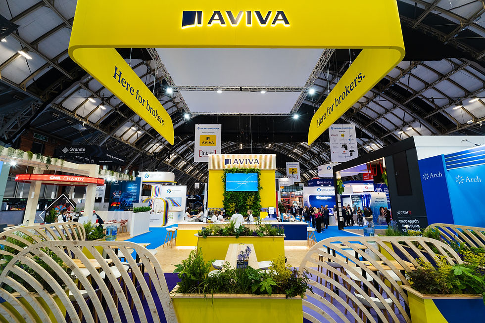
Aviva’s Bustling Base
As a principal sponsor of the BIBA conference, Aviva’s name is highly recognisable in insurance circle.
Bringing our expertise together with the team at Aviva, we designed a space that proudly announced Aviva's well-known presence across the crowded hall, with a huge banner in their distinctive yellow.
The main tower featured a living wall, with a TV sprouting from its midst, giving it a pleasant green contrast with the yellow, and a calming, serene nod to the natural world.
Because of people’s familiarity with Aviva as a brand, their stand experiences a lot of traffic. Therefore, the primary aim for this expansive space was to ensure that this business was PART of the design and not working against it.
Therefore, we crafted Aviva’s space into a bustling hub, where people could stop for coffee and a chat. For that reason, beyond the main tower of the exhibition stand, Aviva’s space was crafted into a homely, welcoming hive of activity, with tables, bars and barstools where people could connect comfortably over their fresh drinks, poured at the bar by The Barista.
This space was defined by a delicate fence of exposed timber dividers, interspersed with bright yellow planters to add to the natural, inviting feel.
To check out more about our process designing and building this stand, head over to our portfolio...
A Fittingly Peachy Paradise
At IMAGE, we’re all about consultancy, and that means working with the core of what your brand represents, and what you want to say. Peach’s BIBA stand was a lovely example of this confluent partnership in action: Peach, as ever, made a bold appearance.
We worked with them to shake up the expectations placed on the insurance industry. For Peach, it’s all about creativity, self-expression, thinking outside the box. The results? Their unique colour palette stood out across the busy hall at Manchester Central, a bright and warm beacon in this noisy sector.
Peach’s iconic namesake colour was the order of the day. A backdrop of solid peach, splashed with outlines of peaches. These colours complemented the timber framing, shelves and countertop really nicely, and were off set by a delicate splash of green in the corner of the space.
We implemented a couch and bar seating into the background of the stand, giving people that all important space necessary to make those connections.
As their graphics depicted, Peach aim to be ‘Your Insurance Partner’, and this stand expressed a colourful, vibrant friendliness which helped them tell that story, before any words were even spoken.
By working with a client to make the most of their existing brand, we create exhibition stands that amplify their unique capabilities and identities and demand visitors' attention.
To delve deeper into this peachy inspiration, check out our portfolio.

iPrism's Sleek Simplicity
iPrism approached BIBA with the intention of highlighting this idea of ‘effortlessness’ in underwriting. For that reason, their stand needed to appear effortless and connect with visitors effortlessly.
Elegant, sleek, and simple: their stand did just that, and was a masterclass in gentle brand activation and visual storytelling. This light colour palette contrasted nicely with the black boxes which featured their logo, and a succinct list of the services that they offer.
All was set against a simple white backdrop, which incorporated the greens and blues of iPrism’s already sleek logo.
Add to that a simple seating area, set against the landscape television screen, and closed in by a planter with the iPrism logo, its leafy contents spreading out, matching effortlessly with the distinctive iPrism greens of their graphics.
Overall, iPrism’s exhibition stand was welcoming, with light, bright interiors and a space that was simple to engage with. PLUS! The team were able to offer cute teddy bears, so that people carried a reminder of iPrism beyond the event itself.
It just goes to show that creativity doesn't always have to be big flashing lights and bold moves. It can often be about intentionality: finding neat and tidy moments for connection and trust-building.
For more information on this sleek exhibition stand, have a look at our portfolio.

MSIG: Games to Grab Attention
This year’s was MSIG’S debut BIBA under their new name. It was important to promote a sense of continuity from last year’s stand, so that they were still recognisable. Beyond that, consultancy with the team at MSIG taught us that they were keen to build on last year’s success, and continue with the attention-grabbing immersivity of gamification.
You might remember Daisy the cow last year- an interactive game shaped like a lifesize, milkable cow.
This year, a different approach. MSIG’s exhibition stand incorporated a game front and centre. But it’s important that this game works to complement the stand, and the brand messaging. It can’t just exist for the sake of it.
So, this year, the game was a catch-it game, designed to test reflexes by getting participants to catch batons as they fall, at random, from the frame. Like that, MSIG were able to use this game to emphasise their brand mission which is all about speed and efficiency.
And, as visitors flocked to compete in the game, MSIG were able to grab their attention, and begin to build those all-important relationships. The Barista were again on hand, behind the counter, well-signposted by bright red graphics reading, “Fancy a coffee?”.
There was then a nice pergola-esque area. This was a private corner of the exhibition stand, with bar seating inside, so that people could enjoy their coffees surrounded by mugs of sugar and some graphics detailing MSIG’s messaging on the wall.
All was white, red and purple: MSIG’s brand palette, creatively employed to be as engaging and exciting as possible. Consultancy with MSIG always reinforces the ways in which companies can always come up with innovative ideas to engage any number of audiences.
To discover more about MSIG's stand at BIBA, have a look at our portfolio.

Ensuring Creativity in Insurance
Insurance is a busy category. But, far from making us nervous, that business can actually be used to your brand’s advantage, because when you stand out at a busy event, it’s doubly impressive.
As ever, challenges are just that: challenges. They’re not barriers to a brand’s success, but an excuse to think creatively about what you want to offer, and the story you want to tell.
Inspired?
Check out our portfolio for more details of our exhibition stands.
And, if you just can't resist, and you want one of your own, here are our contact details...


Comments